top of page

Packaging design concept – Milkcare
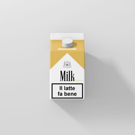
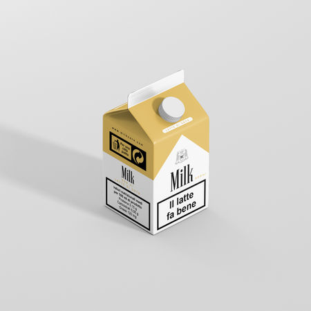
This is a personal packaging design study exploring clean and minimal visuals for milk cartons. The project is not affiliated with any real brand and is intended for illustrative purposes only.
This is a personal graphic design project that plays with the style of cigarette packaging in an ironic and positive way. The idea comes from the famous message “Smoking kills”, changed here into “Milk is good”.
The design uses a similar color palette and font style to Marlboro, but the message is completely different. The goal is to explore how design, colors, and typography can change the meaning of a message and how we see everyday products.
This project is only for creative and illustrative purposes. It is not connected to any real brand.
Project Gallery

bottom of page


